Captain's Log: Stardate 78422.5
Recently I've started to feel pretty good about Anukari's reliability and compatibility with a broad cross-section DAWs. Having 12+ DAWs set up to test against has helped, and the chaos monkey has also really started to give me confidence that it's getting harder to crash the plugin. And performance is also looking pretty good on many machines. So finally I'm feeling like I can spend some time working on making it more usable. This is something I've wanted to work on for quite a long time, but when a piece of software is crashing a lot, it's hard to argue that the crashes themselves aren't the biggest usability issue, so that comes first.
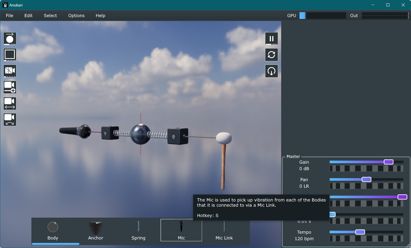
The first big improvement I made this week was adding the "entity palette," which is a horizontal menu at the bottom of the 3D view that presents little thumbnails of all the different kinds of entities that you can create, allowing them to be dragged into the 3D world to place them. Previously you had to either use the right-click context menu or hotkeys to create entities, and that only allowed the creation of top-level entity types. So for example, to create an Oscillator exciter, you had to create a Mallet exciter and then change its type to Oscillator. Now, you can just scroll over to the little picture of an Oscillator and drag it into the world. Here's what it looks like:

The thumbnails are a huge help in terms of figuring out what you want. They're way easier to work with than just a textual list. They are automatically rendered based on the actual 3D skin that you've selected, so the visuals you see in the palette match what you'll actually get in the 3D world. This made it substantially more complex to build, but I feel that it was worth it so that the visuals are consistent. Also, I think it's just a nice touch.
Another really helpful part of the palette is that it provides a place to add tooltips for all of the entities. Anukari's interface has problems with discoverability; there is a lot of complex stuff you can do, but historically there hasn't been any way to learn about it, other than perhaps watching a tutorial video. But now you can go through the palette and mouse over any of the entities and get a quick idea what it does and how it functions. In particular, the tooltips discuss how entities need to be connected to one another, which is a bit of a tricky issue which calls for another solution.
In Anukari, entities that interact with one another have to be explicitly connected via springs or various kinds of "links." It's not immediately obvious how this works; for example, springs can only be connected to Bodies and Anchors. Exciters can be connected to induce vibration in free Bodies but not Anchors, but also they can be connected to Modulators to have their parameters modulated. Even more complex systems exist, such as Delay Lines, which connect to entities that operate on waveforms.
Previously, the only way to learn what kinds of connections were possible was to select an entity, choose the "connect" command (or hotkey), and when you dragged the resulting link around it would only snap to the entities that were valid connections.
The new system that I've implemented is much better. What happens is that whenever you are placing a link, all of the entities that you can connect it to are automatically highlighted. And the highlighting color is color-coded based on what kind of link you'd get if you were to make the connection. And the really cool thing is that with the entity palette, you can drag in a specific kind of link, and immediately see what you can do with it. This makes the link system dramatically more discoverable.
Here's an example of the highlighting in action. In this video I drag a spring from the palette into the world. Immediately it highlights all the entities that it could be attached to, which is all Bodies and Anchors. I drop it on an Anchor, and the set of highlighted entities changes: Anchors can't be connected to other Anchors, so only the Bodies are highlighted.
For a long time it's irked me that the mouse/keyboard controls used to move the 3D camera around are so obscure. It's kind of an unavoidable problem to some extent, because between zoom, x/y rotation, and x/y/z pan, the user has control over 6 degrees of freedom, and a touchpad only has 2 degrees of freedom. Gestures help with this a bit, for example two-finger scroll adds a degree of freedom. And on a mouse you can use the wheel for that. But ultimately it's difficult to avoid the use of modifier keys to access all the camera dimensions.
During the pre-alpha, I've had to point users to a document that lists all the camera controls. I'm pretty sure that this is super not-fun. So it's been a goal for a long time to make the controls discoverable in the plugin itself. But I wanted something better than just a help menu that parrots what's in the doc.
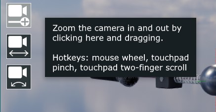
Finally what I ended up with is a system that's loosely based on a feature in Blender (3D modeling software that has to solve this problem): there are now icons hovering over the 3D viewport that you can drag with the mouse (or touchpad) to adjust the camera. So there's a zoom icon, a rotate icon, and a pan icon. Each of them highlights on mouseover, and changes the cursor to the open hand, and when you click changes to a grabby hand. So it's fairly obvious that you can interact with them by dragging, and then once you try it, it's quite obvious what it does. The 2D icon graphics need improvement, but they're pretty communicative at this point.
I think for a lot of users, dragging these icons will be a fine way to control the camera without any further learning. But for power users the icons serve an additional purpose: like the entity palette, they provide a place to put tooltips, and in the tooltips, the hotkeys are explained for advanced users:
There's still a lot of work to do to make Anukari easy to use. One thing that I've been experimenting with is how to show that snap-to-grid is enabled in the 3D view, since this has been a source of confusion in the past (a user created new entities and was confused by their placement -- it was because they forgot that snap-to-grid was on). I've tried a few kinds of visuals but so far haven't found anything that is helpful and also looks good. Another thing I want to do is to automatically highlight buttons in the GUI when certain events occur, to hint to the user what to do next. For example, the circuit breaker feature can optionally pause the simulation if it detects a physics explosion. It pops up a message explaining this, but I'd also like the button that resets the simulation to pulse/highlight in some way, so that the user will immediately see what to do.
But even with these few improvements, I'm starting to be quite optimistic that I'll be able to make the experience for new users pretty fun.
Founder and Developer of Anukari

The Audio Units logo and the Audio Units symbol are trademarks of Apple Computer, Inc.

VST is a trademark of Steinberg Media Technologies GmbH, registered in Europe and other countries.
Captain's Log: Stardate 78674.7
Evan Mezeske
Mar 2025

Captain's Log: Stardate 78275.5
Evan Mezeske
Oct 2024

Captain's Log: Stardate 78006.4
Evan Mezeske
Jul 2024

Captain's Log: Stardate 77836.9
Evan Mezeske
May 2024
